
SFMOMA Visual Identity Has CCA Roots: Some Faces Behind the Rebrand
Learn about how graduate design alumna Jennifer Sonderby led a stellar team of designers—including several CCA alumni—in the visual rebranding of SFMOMA.
It was a moment of jubilation—but definitely no rest for the weary designers who’d created them—when the massive S-F-M-O-M-A letters went up first on the facade of the new Snøhetta expansion, then on the Botta edifice, of the San Francisco Museum of Modern Art.
The reopening of the museum this week after three years of closure is significant for the city, to be sure, but it is profoundly special to the designers, many of them CCA alumni, who masterminded the new graphic identity that visually ties together everything about the new museum experience.
It is highly unusual for institutions of this size to consider redesigning their identities in-house, but it was a leap SFMOMA—a museum with a long track record of excellence in design--was willing to make.
“It made sense that my team could and should take this on given the respect that our work has earned us in the institution and in the field,” notes SFMOMA Design Director Jennifer Sonderby (MFA Design 2002).
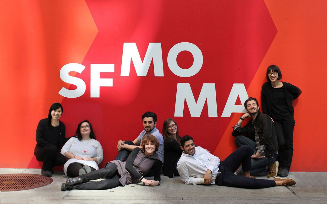
SFMOMA Design Studio team. Left to right: Amy Yu Gray (MFA 2012), Carrie Taffle, James Provenza (BFA 2011), Jennifer Sonderby (MFA 2002), Jennifer Schnell (MFA 2014), Bosco Hernandez, Mathieu Stemmelen (BFA 2010), and Sophine Lim
.
Building a Team
Because a few key design positions opened up just as the rebranding project began, Sonderby was able to build a team precisely to suit that purpose. The first hire, James Provenza (Graphic Design 2011), notes that the operations of the in-house studio reminded him of his time at CCA, and that that absolutely helped him hit the ground running.
“I’d worked after school at Volume and MendeDesign, and that of course made a difference as well, but the deeply conceptual approach we were taking at SFMOMA resonated with Eric Heiman’s GD3 course,” says Provenza.
“Also the way we work both individually and collaboratively reminded me of the strong culture of critique at CCA. Both scenarios involve constant conversations, strategizing how to move the strongest ideas forward.”
The next hire, Mathieu Stemmelen (Graphic Design 2010), had most recently been at the branding agencies Landor and Moving Brands, and says that even at CCA he was already interested in graphic identities.
“I am always excited about a project when it’s in its preliminary stages, when I’m brainstorming concepts,” he says. “It’s gratifying to look back at our path to where we are today with the museum’s identity and see a clear trail from idea to execution.
"I mean, it’s a winding trail, certainly, but it hangs together in retrospect and proves that the ideas we landed on at the beginning were indeed the best, strongest ones.”
Museum’s Closure Brings Focus
Sonderby reflects that the closure--three full years of respite from ordinary operations--was key to their ability to focus. “We took a couple of weeks just to breathe after the design and launch of the SFMOMA On the Go campaign, and then dove in, since the first deliverable--assets for the architectural wayfinding signage, needed for the construction plans--was looming.”
From July 2014 to April 2015 the team held numerous internal stakeholder meetings with curators, trustees, members, and others. They undertook exercises in which they reflected on other institutions’ identities and discussed whether the formal attributes and look and feel corresponded with the experience of those institutions.
It was critical that the final solution not just be formally evocative but that it should clearly communicate SFMOMA’s core institutional values of openness, surprise, welcome, and participation.


CCA Training: Essential to the Process
Amy Yu Gray (MFA Design 2012) joined the team (coming from Chronicle Books) just as the logo was being finalized. “My first week here, we had so many conversations about kerning--and I mean millimeters, pixels!
"It was amazing to be around other designers who cared as deeply about details as I do. I also was reminded of CCA crits, where we were constantly zooming in, then zooming out. Big picture, micro picture.”
Sonderby observes that CCA trains “thinkers rather than just doers”--the sort of designers she was looking for in her team members. Formalism is essential, of course, but it’s not uncommon for a rebranding effort to get lost in dithering over T-shirts and letterhead and forget that a strong concept, while hard-won in the beginning, will make all of those decisions unfold naturally later on.
“We still have loads of work to do and problems to solve. Every day is a rollout. But because we went through this process ourselves rather than outsourcing it, we have a tight team that has immersed itself in this design for the past three years and is deeply invested in it.
"We know how to make the concept live and breathe.”
Sonderby notes that SFMOMA’s new visual identity couldn’t have happened without the other invaluable members of its Design Studio: Bosco Hernandez (MFA Design, Werkplaats Typografie), Sophine Lim (MFA Design CalArts), Jennifer Schnell (MFA Design, CCA), and Carrie Taffel (Boston University).